Nice detailing – the bird especially looks very nice. Overall great modeling and ideas 
Since this one’s finished, some comments for future efforts: the crop and gesture seen in your original zsphere was changed in the final, resulting in a reduction in the dynamism and ‘story’ of the scene.
The initial posing tells the viewer a lot about what’s going on: character slightly off balance, arm raised almost defensively in front revealing the struggle; the spear pointed directly at the bug showing what the struggle is against; a wider crop, giving an important sense of scale, not only to the individual elements, but also to the event being depicted. Even without any detail being present, there’s a lot of interest for the viewer.
Specific issues (in my opinion):
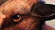
-If you draw imaginary lines along the apparent line of sight in the final, none of the creatures are engaging with each other. The tiger fellow is looking up in the sky far above the bug, the bug is looking straight left above the tiger, and the bird seems to have it’s head coc.ked, dispassionately looking outward over the viewers left shoulder. For the bird, having its beak point at the bug probably doesn’t realistically depict its gaze, since birds see more to the side than the front, but doing so would convey its attention to the viewer.
-The tiger’s grimace is reading as a grin. Seems like he’s having a great time posing atop his bird.
-The tiger appears to be situated strangely on the bird’s head. He’s turned – I think his left thigh would be covering its right eye, and he’s perched higher on its skull than would be desirable. This seems to detach the tiger and bird from each other as if you drew a building and a street in different perspectives.
-The tiger’s scale vs the bird scale. I’m not sure but it looks like you made the tiger bigger someplace in the process… He seems too big to ride the bird now.
-The tiger’s been straightened in his posture. No longer does he seem to be in a struggle, seems much more casual.
-The spear is pointing way too high. It should be pointed directly at the bug. Note, even in the original this was slightly off, but it was made worse. This feeds strongly into the next item:
-The composition is suffering from scattered lines. The spear and the bird’s beak are both creating lines that lead the viewer’s eye out of the scene. The dagger in the tiger’s hand is leading the eye astray to a lesser extent. The bird’s claws are a hot spot of interest (due to value contrast) that also point away from the action. The line-of-sights mentioned earlier figure in here as well. The bug’s stinger WAS improved from the start, however: it is posed well to point back at the tiger and bird.
pointing the spear and the beak toward the bug would create a cycle that ‘traps’ the viewer’s eye in the scene. I would also try to pose the bird closer to how the bug is, with the claws positioned offensively forward as if it were prepared to attack with them as well. This might compositionally create opposing and wedging arcs.
-Tight cropping shows off your detail, but makes things feel like toys. Zoom out, and possibly add additional out of focus bugs in the back/foreground to legitimize the title.
-Consider removing the tiger’s dagger from his hand. Ideally, he probably should be holding reigns instead that logically tie him to the bird, and compositionally complete the cycle from bird to tiger (to bug to bird to tiger…)
-consider increasing perspective distortion with a wider camera field of view. Zbrush’s default perspective is set to a focal angle of 50 which is a setting that works great for portraits and maintains a pleasing corner on cubes, but doesn’t do much to enhance depth. Bump the focal angle up a little to see if the scene becomes more dynamic.
Anyway, sorry to make this so long… the detail work here is great, with a better composition the piece could be just as good
-oof


 ](javascript:zb_insimg(‘198751’,‘zsphereswarm.jpg’,1,0))
 ](javascript:zb_insimg(‘198789’,‘thumb.jpg’,1,0))