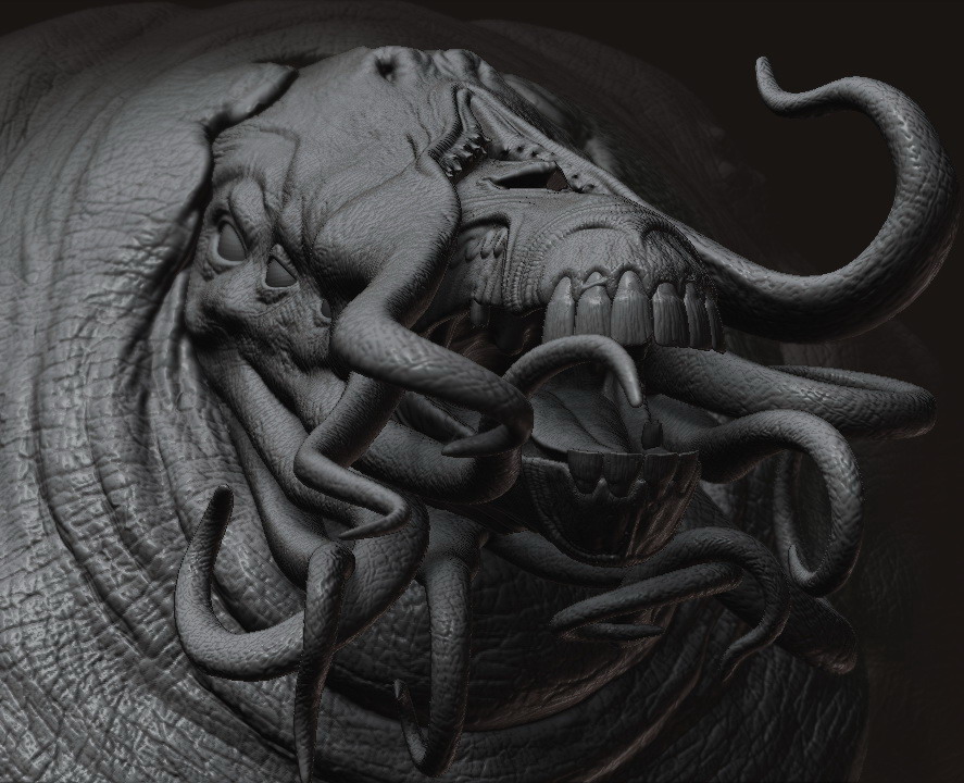
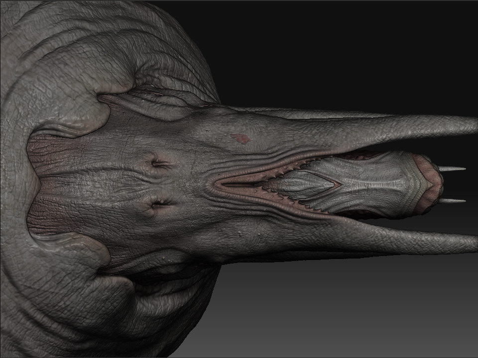
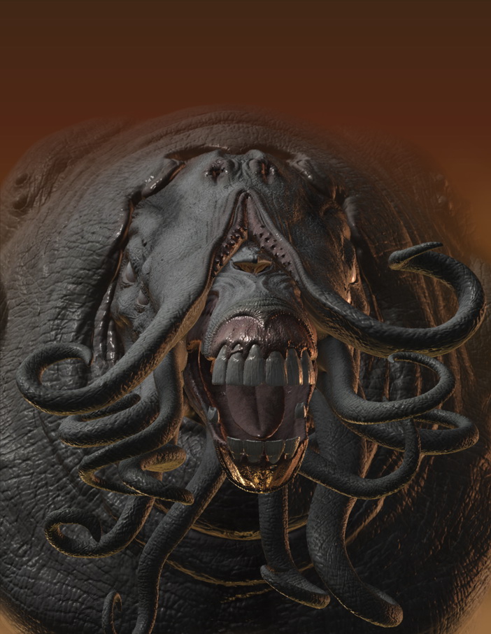
Hi, I thought I’d try and model an existing design. So I decided to create an early Sammael design from Hellboy using “The Art of the Movie” book. I chose this early design as I liked the use of a horse’s skull in the design.

Hi, I thought I’d try and model an existing design. So I decided to create an early Sammael design from Hellboy using “The Art of the Movie” book. I chose this early design as I liked the use of a horse’s skull in the design.

that is awesome. Nicely sculpted.
Very nice model…love the details you pit into the beast! 

This would be great for a stereo 3D picture. Just take a screen grab of it. and rotate either left or right about 20 Percent and take another one. Then put both images beside each other and cross your eyes until they overlap. Or you could put the images into a program like anaglyph maker to make anaglyph (red and blue glasses) images. This is definitely a great candidate.
You have great detail going there. Great model, please post some more views. 
Thanks for the comments guys. Jon DP, yeah, it would work well in 3D. 


Incredible modeling and detail!
Dickie
i totally agree dickie 
The texture really closes the deal on this one. Congrats. 
the perspective on the creature in that first shot is so dramatic and awesome
Thanks for the comments guys. It seems I’ve had software/hardware issues and ZB3 won’t allow me to open up the latest file. Possibly due to the file size. I accidentally set two levels of HD geometry to the head. Which is a little ironic as I had forgotten to view the HD detail in the last 3 images. 
 This is quiet annoying. :angry:


MXHe’s still not properly posed. Have to wait until the bugs have been ironed out of ZB. Anyway, I had a go at lighting him up.

Crits and comments are welcome as always.
MX
No crits from me. I think it’s looking great so far! Keep posting 
-Kris
Neat monster…
only tip is on the wet bits…
Add a reflection, and it will look more slimey and wet.
… I didn’t want to start a new thread just for this. It was a Mat-cap test. It’s the closest I could get to original character. 
MX

Lol! Very nice!
Haha, you’re showing a good range in subjects. 
Nice sculpted. More color in it’s mouth?

Great work, especially Morph… 