ZBrushCentral

Fat Mafia Boss

Hi everybody,

im also new to this forum, so first i wanne say hi to everybody. this is such an incredible froum, its always a pleassure to view all these amazing works and threads, so many outstanding artists here, just great. :slight_smile:

however, i thought its time to post some of my latest work here and see what you guys think. its my version of an “Fat Mafia Boss” and my first time using Zbrush. the basemesh of the head was modeled in XSI, and then refined and detailed within Zbrush, also texturing was mostly done in ZB together with the ZApplink plugin and Photoshop.

i hope you guys like it.

thanks for taking a look. :slight_smile:
dean

here are some other shots i did just for fun:

ZBCImage1.jpgFinal_MB_Expose.th.jpgFinal_MB_2.th.jpgFinal_MB_3.th.jpgFinal_MB_Expose.jpg

Wonderful character.

Fantastic really dig the style on this one. Your thumbnails went down from highbandwidth so i said to myself this must be over on cgtalk too and sure enough its on the front page already. congrats

Welcome Dean, I’m liking your character, even without you putting he was a Mafia boss, he still looked like a bad guy from first viewing…

I like the top thumbnail the best, but I can’t access it from Imageshack…:frowning:

Congrats on the top row at CGT & the Expose entry, I’m sure we’ll see this on the top row here too…

Well deserved…

:smiley:
I think he’s got a brother… (something I never got back to doing)

Wayne…skinfix2-adj-web2.jpg

…Marlon Brandon but very effective! :smiley:
Have happy Zbrushing! :sunglasses:

Nice model and texture work, Dean :+1: …i hope to see more of your work on this forum :sunglasses:

jantim

i love the head and texturing, great work. And I think i might have one of his henchmen, check out charlie boy. top stuff

Sha

Myself and your character share a similar pallor.

Queeazy complexion and a coool character and composite.

Sweet style :slight_smile:

Dean, congrats on top row. Gross charicature; LOL-- in a different color, he’d be a Blues Brother.

BTW, is he gunning for Kruger? http://www.krugerstars.com

lol its not worth top row, not eaven 5 stars work, 4 at most. The ears look terible, and wheres the texture on the lips :expressionless:
its not that i dont like it, but this is definetly not top row …

I agree not worth top row. This is where I look bad but you cant please everybody, but from my point of view it looks to much like darthwayne’s model just with a few changes round the face and a hat added. I mean if you have been influenced by someone you should give them credit.

Katrina

You look at that fat face and you just know he is up to no good. Great character. The atmosphere is awesome. :+1:

Very nice atmospheric piece. Can’t wait to see your future work.

:+1: :+1: :+1: :+1: :+1:

I like the cauliflower ears. That along with the flattened nose shows that this guy is a real brawler. IMHO art is about emotion. Without emotion there is no art. 5 stars here.

Really cool texture work. :+1:

thank you guys very much for taking a look and for your your comments. i know you never can please everyone, but i`m glad that most people seem to like it. :slight_smile:

@Buckie
thanks.
yes, due to the CGTalk Frontpage plug, imageshack deleted my pics due to the high-bandwith usage. i fixed one of the links, a friend of my was kind enough to host the images on his server so it should work now. :slight_smile:

@DarthWayne
hehe yes, nice head. :slight_smile:

@jantim
thank you. i`ll try my best. :sunglasses:

@panstar
yes man, charlie boy looks great, cool stuff. :slight_smile:

@boozy floozie
sounds interesting. :wink:

@Strannik
thanks.

@Davinci990
LOL thank you, nice idea with the blues brother. don`t know what you mean with “gunning for kruger”, but the krugerstars pics look awesome, thanks for the link. :smiley:

@slocik
sorry, i had no idea that there is any differences between those “mystical” rows, but i guess the people who are responsible for this are pros and so i think they know what they`re doing.

@toxictwin
are you serious? im sorry, but the only thing that these two images have in common is that there is a "turbulent male guy, looking kinda mean", youll find thousands of pictures like that on the internet, so should i give credits to each and everyone of them? in my case, i didn`t use any reference, i made this image just the way it came out of my mind.

@Giantsun
thank you. :slight_smile:

@Blaine91555
thank you man for these words. i also think art is about emotion, not about Perfectionism (like someone also wrote on another forum). every image has its strong parts and its weak parts, but IMO the overall impression is what counts, because you can always find something to crit if you want to, no matter what image you choose.

@Chatin
thanks.

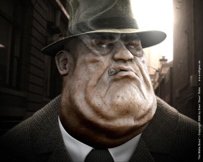
here`s a pic of the sculpting process if someone is interested:

and here`s an earlier WIP shot:

cheers,
dean

Hey Dean, Congratulations for this great work and the top row, I really liked dude.
Cheers,

Alan

good job! To be honest I like the untextured, earlier wip-shot most. It porcures much more detail, more character imo. Maybe its only the lightning, the textured version seems a bit milky and shiny. But hey, it looks great :slight_smile:
4*

greets
froyd

really cool the guy, the texture is great