this is a really awesome piece! - the new one is way better than the old but maybe still needs some tweeking. When i’m struggling with these same issues i bring the Ryan Kingslien anatomy example in as a subtool and compare. i’ve done it for you with your image. Maybe these are good suggestions or you can see some better ones.
btw - the reason i don’t have the feet touching the bottom of the boot is because such massive armor seems like it would have some thickness to the soles.
Thank you for the comment kevphil!
magbhitu… i dont even want to think about retopologizing this thing, :eek:
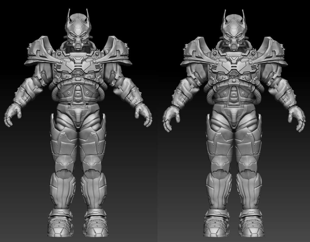
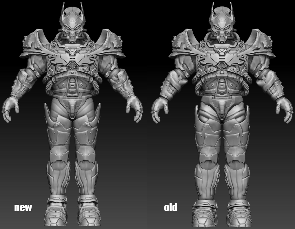
Now just a quick question… which is better, left or right?
There are very minor changes so if you can’t spot them… they are…
-Changed the size of the hands
-Changed the size of the chest piece
-Changed the shape of the lower leg piece
(the shoulders are also different… but that one its definitely gonna stay as it is on the right)
Nice work. I think it doesn’t really matter which you choose because if the changes are so undetectable that you have to point it out to the audience, you can go with either. The overall silhouette is the same and the aura it projects will still be the same regardless of which you choose.
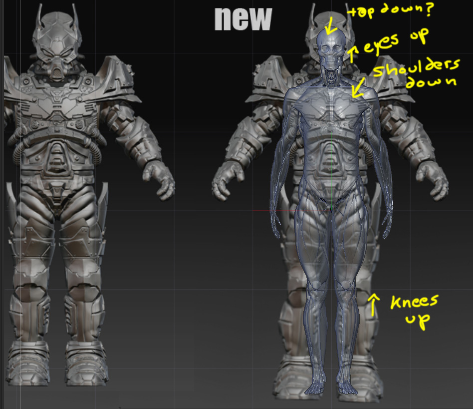
however, I would adjust the proportion of the character first before you go any further. Right now it seems the model is sitting at 6.5-7 heads… It’s too short for a normal proportion character. Try to play with the model and see what you can get. Personally I would try to extend the legs for one more head, and extend the arms to half or one head, and see how it will look like. It would also help if you can adjust the proportion with the arms down on the side so you can see the length of the shoulders. Personally I think the shoulders can be broader but its hard to say without adjust the actual model itself.
i would strongly suggest you to get the proportion done before you work on other parts of the model as it will be very difficult to adjust after you sculpt the hard surfaces.
Actually you are right… the differences are very minor that i dont think it will change much. I have just been struggling for so long with the proportions that i became uncertain with everything i do now.
Actually the model is 8 and a half heads high.
The top of the head is just additional armor and doesnt count as the person inside’s actual head and the chin is also cut short cause the gas mask extrudes down past his chin. i found out armor kinda has these tricky things.
I followed this guideline for the proportions: http://www.idrawdigital.com/wp-content/uploads/2009/01/prop_var.gif
As you can see my model fits into the more bulky type of human, which is good cause i want him to be a bulky armored character. So now if i change the length of the leg, it would go over 9 heads… which would be too much, wouldnt it. I tried changing the length of the arms a little in photoshop, but he started to look like a gorilla with the too long arms. I will try and play with the shoulder a little and see if i can get better results. Thanks for the advice!
Ok so I got some feedback from Steven Stahlberg about the proportions (here i am again with the proportions)
They advised me on making the feet smaller, and to not make deep cuts in the transition from the arm and hand (which made it look like a toy) Also was advised to not make the armor so buldgy on the lower legs and front arms, and have it follow more closely the human structure. And lastly, another observation was to make his legs go a little higher up the hips to make him seem taller.
Your new improvement is leagues better. While you were certainly mathematically correct proportion wise, because the legs were so thick etc it wasn’t reading correctly. The new changes help it tremendously. Most of your hard surface details look great, though there are some that are becoming rather mushy, unless I’m reading those wrong and they are supposed to be a leather or some other material. Specifically I’m talking about the armor around the forearms. You have a lot of wavy lines that make it a much softer material, but it looks like you are trying for a hard surface like metal rather than a leather etc.
Thank you for the comment tcarter3D! The mushy parts you are referring to are part of the concept mesh… they are basically there just to serve as a base mesh to make the final mesh… i did it on the chest armor, now on the helmet and the rest of the armor will recieve the same treatment! So it will all have that hard metal look in the end.
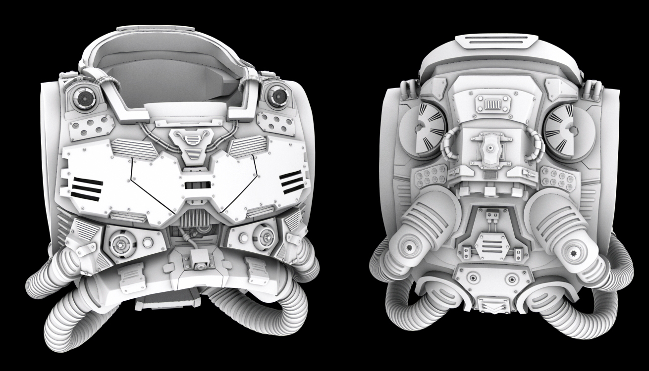
Now on to a new update… i have finally completed the helmet! Here it is:
And here you may see the evolution from the concept mesh:
Again, the concept mesh looks so blobby to me after comparing…
Any comments and critiques are welcome.
Got another update… this time with the waist area…
Top is the concept and bottom is the final version… i added the other parts cause it was hard to tell much about the parts with them alone…
As you can see I made some big changes in the design with the stomach area cause i felt that the concept did not allow the model to bend forward… the new design would let each of those horizontal pieces slide over one and other when he bends any way.
This rocks, M1KES. It truly does get better and better. Good advice from xenoo, though. I get a real kick out of all the wires you have coming out the back of his head! “Some assembly required.”
Thanks for the comment xenoo! I feel i might go a little too overboard with some details, but I dont think it detracts from the overall look of the model yet… thanks for the advice!
Also i took a look at your hard surface model… it looks amazing!! Congratulations on that one!
Thank you kevphil! It’s actually part of the concept, hehe. It was one of the things that caught my eye when i first found the concept!
Added some changes to the undersuit… giving it a hexagonal pattern. Here is a full body view with the arms, hands, legs, feet and shoulder armor still in concept mesh stage.


