so perfect as is your work
awesome as your work that means i am fan of your work
great great great work
so perfect as is your work
awesome as your work that means i am fan of your work
great great great work
hi thank you very much
Hi I haven’t post for a while cause I was busy with work but I thought i should post my latest piece. I don’t have enough In Game experience and this is one of my first decent looking ones. I hope you guys Like it. Thanks
[]
11.683 Tris 2K Maps 
[]
[]
[]
[]
[]
[]
[]
[]
[]


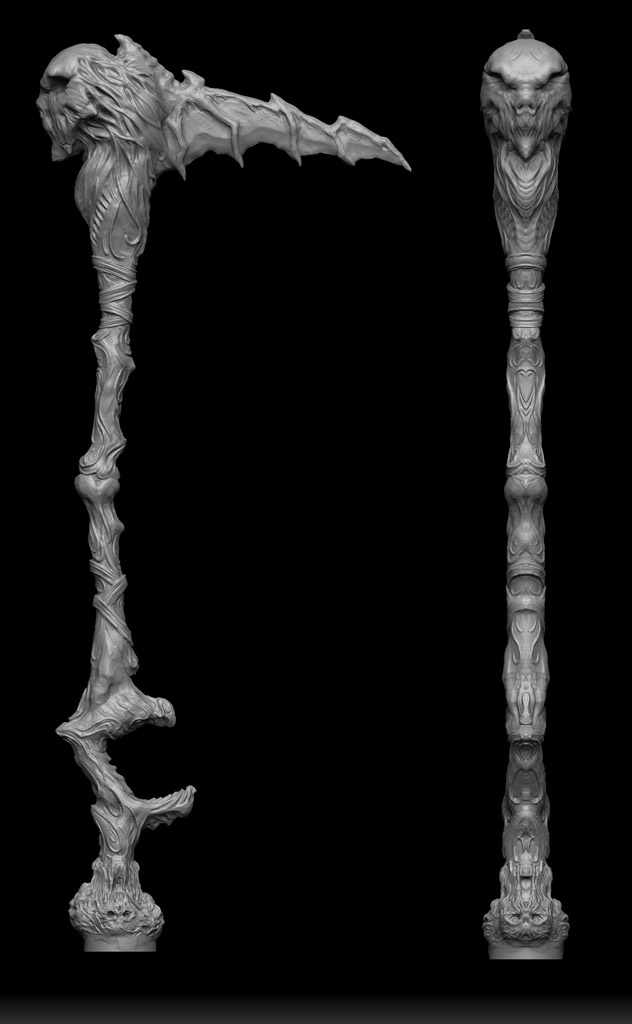


Very nice ! Can you show us a wireframe shot ?
thanks I will post wireframe later on when i go home and hopefull a turntable too
Very cool. A few more shots of the grey model without the textures would be nice as well, there’s a lot of great detail in there.
Hi i just decided to upload some extra images  small_orange_diamond:)
[](javascript:zb_insimg(‘260200’,‘gray1.jpg’,1,0))[](javascript:zb_insimg(‘260200’,‘gray1.jpg’,1,0))
[](javascript:zb_insimg(‘260201’,‘gray3.jpg’,1,0))
[](javascript:zb_insimg(‘260202’,‘gray2.jpg’,1,0))
Here are some turntables there are bit heavy cause I don’t have a good compression, software use Firefox
I like the overall design, very nice. Really like what you did with the spine.
With that said the secondary forms are lacking a bit, or washed out from the finer details being to strong. It’s easy to spot this if you reduce image size or step back a bit from the monitor. It ends up giving the whole model a flat look and takes away from the over all quality of the piece.
It should be fairly easy to fix either by further defining the secondary forms at a lower sub-d step. Or dropping the model down and generating displacements of the high details then lowering the strength of the higher details. If the details are a subtool/layer (i forget the terminology) then you can adjust it’s influence if i remember correctly.
Cheers
hi I know exactly what you mean but the whole idea is that dude have armor on top, so felt that I need to spent more time to detail the visible parts .
Amazing look and feel … to me !
thank you very much
Cool cool, as long as it was a design choice. 
I really like the way this is heading, hope you dont mind the crit tho, recently on ZbrushCentral people are “touchy” about critique.
Maybe you can move the head in a lot, so he has no neck, try and break the symetry also.
Awesome grey pics, thanks!


