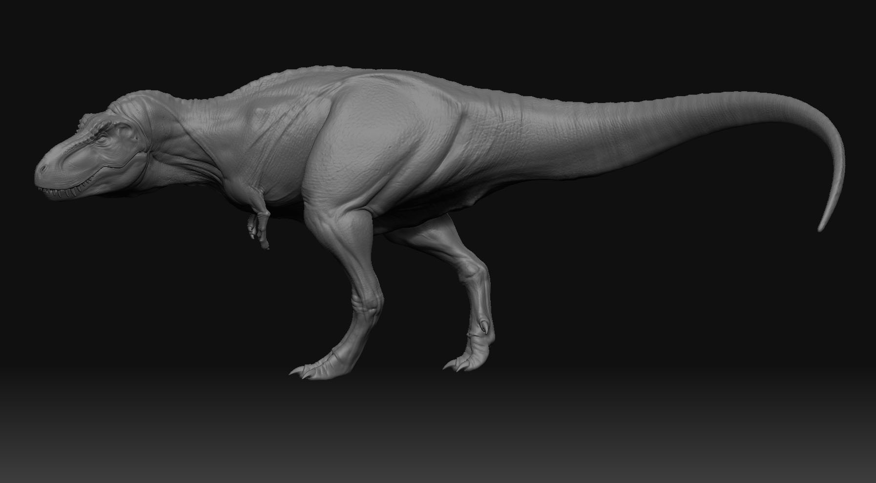
I think this is my fav T-Rex model ever. I just love the proportions.
Hi,
Great T-Rex mate, nice form and nice subtle but, dynamic pose, the front on pic shows that very well.
I like the tension, although if you dont mind me saying, the trapezius muscle looks a little strong, or maybe a tad to sharply defined towards the neck.
That just my opinion though.
Great work, did you pre build in maya or something?
Looking forward to an update fella.

Cheers - Si
That’s good that you have “conviction” behind your decision making with your art. That confidence in your own ideas is what will make your art original. I think you made a good choice by at least adding some texture. Just do your thing, this is awesome. Can’t wait to see the end results!
Here is the final animation and a snapshot… trex just taking a little walk… nothing fancy. The snapshot is a little stylized but almost the same as in the animation… My ultimate plan was to but him in some more advanced environment but i got tired of it and didn’t have time…
animation and reel: http://www.sigurdesign.se/
[ ]
]
thats freakin awsome man!!! 5 stars from me!!!
great reel too!!!
Stellar image. Good work, man. It would be great to see some particulate dust in the air around his feet. It may even help give a sense of scale.
-Dustin
Nice shot, not to sure about the hippo texture. Doesnt really do the work justice after all the effort you have put into this to produce a great animation.
Damn really nice dude!
Wow! Nice animation too, you rock! 5***
that animation is really impressive 

Thanks all for all the wonderful c&c!
Point, when u say it really resembles of a hippo texture… haven’t though about it before… =) perhaps a little odd…
btw, gave him a little ear now… or earhole…
[attach=116287]ear.jpg[/attach]
Attachments

Thats one of the best T.rexs I’ve seen on the forum!!! Don’t know how I missed it!
Glad you like my DVD!
David Krentz
awesome work! Has a real weight to the model and great work on the form.
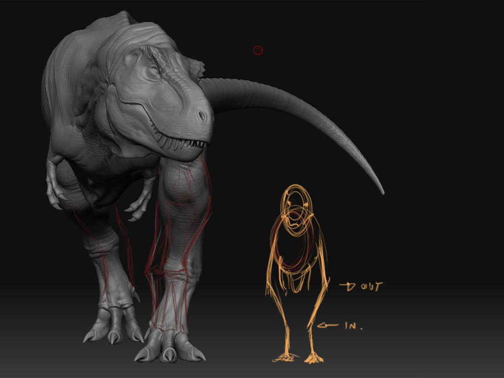
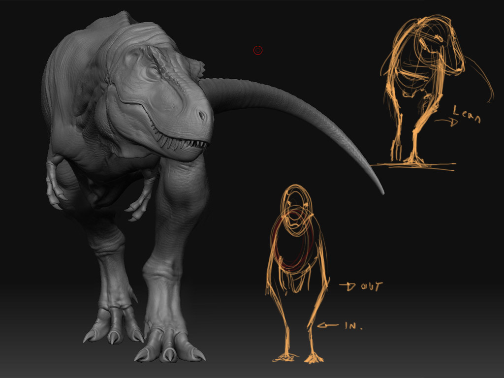
Sorry about this…but the nerd in me couldn’t resist.
From the front view it looks as if the angles in the leg are a little
Off. I did some doodles and a quick photoshop change to illustrate
how the bones fit together naturally. It will effect your pose a little, he’ll need to lean a little to his left for balance. If you make thse changes it will effect your animation too…
But, once again…killer rex!!
David Krentz

Attachments

I think the pose is good,it’s hard to tell but i’m pretty sure that that look can happen if say he is moving his neck down at the same time he is turning it… Great sculpt and stellar pose also…Keep it up… 
Seen this before, terrific job here, wanna see more dinos!!!
Nice to see David commenting=) Couldn’t have done it without your awesome dvd=)
Here is some final clips on the rex project
It was supposed to be uploaded a month ago but I got ill so i couldn’t finish it until today. Its a new setting for the trex but with the same animation as before. I didn’t like the last clip so much so i wanted to make something else… As before its made in zbrush, maya and after effects. The light rig is all regular lights, no fg or gi. I have no particular story behind the clip… i just wanted to make something visual and to learn more about lightning, composition and compositing. Now i will definitely move on with other stuff… enough trexing:D
The video effect is over done in some areas just so i could hide the animation flaws… perhaps a bad decision…
Links:
Vimeo -> http://www.vimeo.com/3444574
Xvid HD version -> http://www.sigurdesign.se/Bilder/Dino/TrexDen_FinalHD.avi (12mb)
[ ]
]

 Sweet. Yeah if you take down that video effect to see more of the Rex
it would rock even more.
-d
best t rex model i have seen, is it not on the main gallery?
The best T rex!!,really cool!!